The LEGO System originaly had only three major themes: Town, Castle and Space. All of them have special place in the childhood memories of today’s AFOLS. It was their starting point, their first sets. Especially the Classis Space has a very stong fanbase to this day. I wasn´t even born in 1978, when the themes were introduced. But it was a pure pleasure for me to go through the old catalogues as a kid and discover the old sets. What I really like about the old catalogues are the dioramas – all the sets presented in the (mostly) real enviroments. Nowadays everything is done digitally and this handmade magic is gone. Only some bold MOC designers like Pixel Fox are keeping this art alive.
I was introduced to LEGO System about a decade later and the real magic happend at that time: two completely new themes were introduced. First were the Pirates in 1989 and than one of my all-time favourite, the Aquazone, in 1995! I remember the moment, when I got the new catalogue for that year and I spent hours just staring at the pages and the new sets! Everything was awesome with this theme: the design, the sci-fi setting, the colour scheme, the art direction of the adds. It just sparkled my imagination. While doing some research for this review I found the the actual art director who illustrated the original posters (yes, they were hand drawn at that time!) for the theme, designed all the logos of the factions and even directed this awesome commercial:
You can read more about it in his blogpost here. He also came up with the idea to use the hexagonal basalt columns as the background for the underwater world.
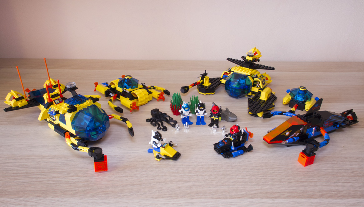
The first wave of the Aquazone theme had two faction competing in deep sea mining operations of so-called Hydrolator Crystals. The Aquanauts were the good guys with yellow/black scheme, transparent parts in dark blue and neon orange. The bad guys were called the Aquasharks with black/blue colour scheme and transparent neon orange pieces with shark eyes and teeth prints. All the submarines also used special grabbing arms (if you buy an older set now, chances are that some of the small parts they consisted of will be broken) and also magnets as a quick release mechanism (like the StarCom toys I wrote about in an earlier post).
The minifigs were also really cool. They had specialised diving gear and masks, silver harpoons and knives and diving fins on their legs. You can clearly distinguish the bad guys from the good – they are literally black and white.

The prints and faces were very nice for that time although there were only a few variants of them and no female characters at all. The only one minifig with a name was the chief of the bad guys, Thresher. He got his name because the hook on his hand looks like the tail of a Thresher Shark.

And now for the sets! Let’s start with the smallest sets.

1806: Underwater Scooter
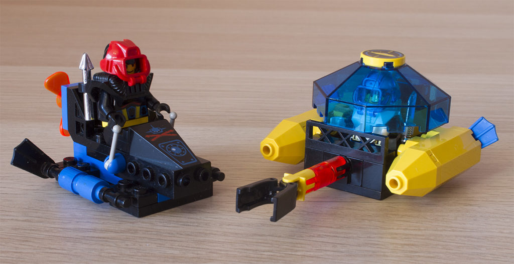
The smallest set was a cool way to get the extra minifig. Today it would propably come in a polybag, but back then it had it’s own box and I think it even showed some alternative builds on the back. It aslo had a cool 1×2 printed tile with showing a control panel for the driver.

6115: Shark Scout and 6125: Sea Sprint 9
The other two smaller sets had a little bit higher partscount and both were very well designed. I really like how the designers used all the key features of the larger submarines on the Sea Sprint 9 – it has the iconic yellow pontoons, the small grabbing arm and even full enclosed cocpit with a large trans dark blue piece and a printed tile with Aquanauts logo. It was the first set I had from this line and I really loved it! The Shark Scout has a special printed piece and is more like an underwater bike, which I think fits the bad guys better than the closed cocpit.

1728: Crystal Crawler
This medium-sized set was unique, because it had two large plastic wheels and four rotating propellers. The clever design choice was to use a suspension part with string to snap the octagonal shapes in different positions. It also has two identic grabbing arms – not like other sets, which typically have the second one with a magnet. Again an awesome design which really fits in the theme.

6175: Crystal Explorer Sub
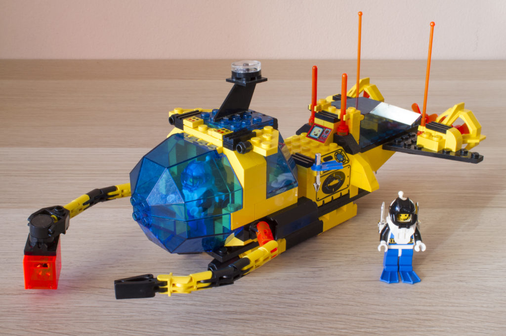
This set defined the whole theme for me. A large submarine with a lot of space inside and quite an unusuall shape. Like other larger sets it also included a real compass piece on the top. It comes with some accesories, octopus, two minifigs and also a speciall neon orange transparent transport box for the crystals. This is one of my all-time favourite LEGO sets.

6155: Deep Sea Predator
The mid-sized sub of the Aquasharks. And it really looks like an angry shark! Sleek and fast with quite low partscount but all the main features. Beware aquanauts, your precious crystals will be stolen!

1822: Sea Claw 7
The last set in my posession is quite odd. It wasn’t in the first wave in 1995 catalogue and it even looks like it was designed by some other designer. I did’t like it at first when I just saw the pictures of it and I still have mixed feelings about it. It has a smaller underwater scooter which fits inside together with the driver. It also uses a rubber band for its large Claw on one side (hence the name of the set) – which was not common at that time. It’s a good set, but it just doesn’t feel right for me for some reason.
Unfortunately my collection is missing the two largest sets – Shark’s Crystal Cave and Neptune Discovery Lab and also the small Spy Shark submarine.
Conclusion
I would love to read an interview with the designers who made these sets – and also other themes from the 90’s. The first wave of the Aquazone is my “Classic Space” and I love absolutelly everything about it. So this review is certainly not objective – but who cares =D
If you have any of these sets, you are lucky! I can only recommend them to any LEGO collector out there and I’m pretty sure you can expect some Aquazone MOCs from me soon! I would love to hear your thoughts about this classic theme so let me know about them in the comments! Happy building and see you in my next classic LEGO sets review. Next time we will propably take look at some 90’s space awesomeness, giant robots and more! See you soon!


1